Some general principles of colour combinations
-
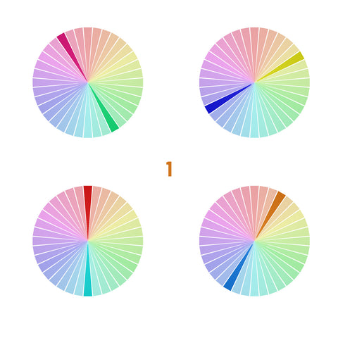
Complementary colours

Complementary colours are opposite each other on the colour wheel, such as blue and orange, or purple and yellow. Pairing complementary colours creates a vibrant and eye-catching combination. -
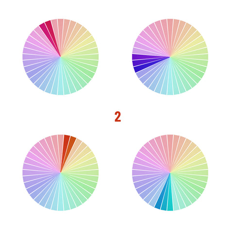
Analogous colours
 They are next to each other on the colour wheel. For example, combine shades of blue and green or purple and pink. Analogous colour combinations offer a harmonious and cohesive look (3d image).
-
Monochromatic colours
Combine earrings of different shades and tones within the same colour family. For instance, pair light blue earrings with a darker blue or navy earring. This creates a sophisticated and elegant effect.
-
Neutral colours
Use black, white, grey, or metallic tones to create a versatile and easy-to-match combination. Neutrals can be paired with almost any other colour, making them a great choice for creating cohesive and balanced looks.
By the way, these rules work not only with jewelry, but also with anything that you try to combine by colour ;)
Of course this will not give you solvation to all problems when choosing a good colour match. And certainly it’s not always only the question of the colour. Form, style, size, used patterns, etc - will also influence a lot, and as a result jewelry will not go one with another even if it’s all ok with the colour combination. And also there are many situations when the colours match each other but their exact shades and tones - don’t look too good together.
But at least I hope it will help you to understand the direction in general.

